Design and Typography
- Mar 13, 2018
- 1 min read
Web typography
Legibility vs readability
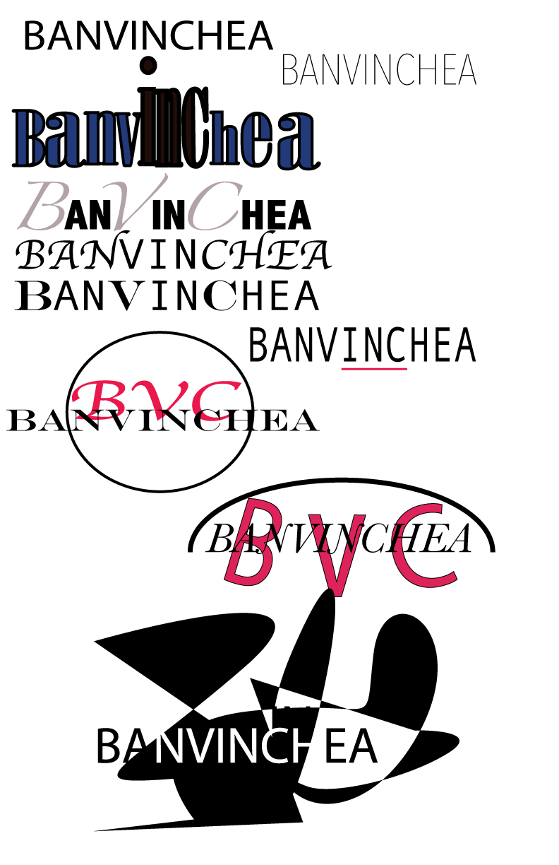
Expressive fonts/type for eye catching readability
Clean serif/sans-serif fonts/type for smaller body copy
Sans-serif fonts designed for screen viewing assist in readability
Legibility
These typefaces should be drawn and ctrafted with consistency among characters, and exhibit highly legible proportions
Serif vs Sans-Serif.
Serif reads best at smaller sizes and can be complementary
Font variance
Too many fonts confuse the reader
Definition
Fonts that are too similar cause ambiguity
Readability
Use upper and lower case letters for optimum clarity
Alignment
Left alignment reads easiest
Consider eye flow as it moves down a page
Emphasis
Use these tools with discretion and without disturbing eye flow
Integrity
Avoid stretching or distorting type fonts
Weight
Strive for a sense of balance
Large text blocks
Strive for consistency, rhythmic rags
The purpose of effective rags is not only to achieve aesthetic beauty, but to enable readers to move gently and effortlessly down a text column
Effective rags consist of lines establishing an informal but consistent pattern of line endings
Consistent spacing
For text type, use consistent letter and word spacing to produce and uninterrupted texture
Letters should flow gracefully and naturally into words, and words into lines
This means that word spacing should increase proportionally as letter spacing increases


Comments